 Ubuntu Phone documentation
Scopes guides - customization and branding
Scopes come with a very flexible customization system. From picking the text color to rearranging how results are laid out, a scope can easily look like a generic RSS feeds reader, a music library or even a store front… If you have an Ubuntu device, you can already have a look at some of your options by swiping to the right and browse the default scopes.
The examples below are using the SoundCloud scope created using thistutorial.
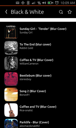
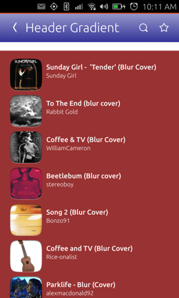
Header and background
There are two places where you can customize your scope. One is the code of the scope itself where you define your categories and cards, we will talk about it in a moment, the other is the .ini file of your scope, registered by the Dash even when your scope has not been started or has been paused by the system.
The
You can add the following keys to the [Appearance] group of this file :
- ForegroundColor - default text color (defaults to theme-provided foreground color)
- BackgroundColor - color of scope background (default is transparent)
- ShapeImages - whether to use Ubuntu-shape (rounded corners) for all cards and artwork (defaults to true)
- CategoryHeaderBackground - background scheme of the results categories
- PreviewButtonColor - color of preview buttons (defaults to theme-provided color)
- LogoOverlayColor - color for the overlay in scopes overview (defaults to semi-transparent black)
- PageHeader.Logo - image containing scope’s logo
- PageHeader.ForegroundColor - default header text color (defaults to the overall foreground color)
- PageHeader.Background - background scheme of the header
- PageHeader.DividerColor - color of the header divider
- PageHeader.NavigationBackground - background scheme of the navigation bar
All appearance keys are optional. Some of them (like
PageHeader.Background) require background scheme URIs, valid URIs for
these keys include:
color://.md#aarrggbbcolor:///blackgradient://.md#aarrggbb.md#aarrggbb/absolute/path/to/image- http://remote-server.com/path/to/image
Here are a few examples of color customization :
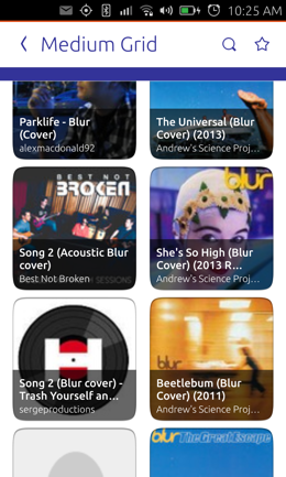
Categories templates
Each category (group of result) of your scope can use its own layout and rendering style using a template declared in your scope code. These templates need to be provided in JSON format and adhere to some simple rules.
Here is a standard template :
{
    "schema-version": 1,
    "template": {
        "category-layout": "grid",
        "card-layout": "vertical",
        "card-size": "medium"
        },
        "components": {
            "title": "title",
            "subtitle": "artist",
            "mascot" : "user_avatar",
            "emblem" : "source_logo",
            "art" : {
                "field": "cover", "aspect-ratio":1.6
                },
                "attributes": "attributes"
            }
        }
    }
}
The “template” part defines how result cards will be laid out within the category. The “components” keys represent each piece of information your cards will display. How to attach information to a field is explained in the Sound Cloud tutorial.
Template keys
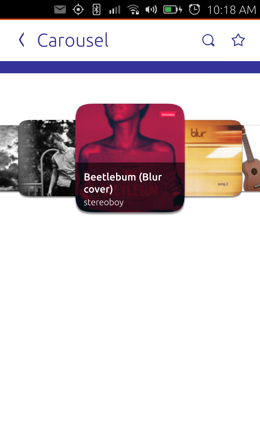
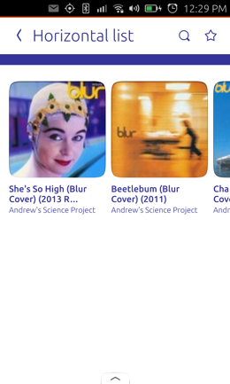
- category-layout: Specifies renderer type; possible values: “grid” (default), “carousel”, “horizontal-list”, “vertical-journal”
- card-layout: Specifies layout of the individual result cards; possible values: “vertical” (default), “horizontal”
- card-size: Size of the result cards; possible values: “small”, “medium” (default), “large”; when using “category-layout”: “vertical-journal” any integer between 12 and 38
- overlay: Overlay text data on top of the art; boolean, default false
- collapsed-rows: Number of result rows displayed while the category is collapsed; possible values: any non-negative integer, where 0 fully expands the category (only affects grid and journal)
- card-background: Background color for the cards; string; URI in the format
color://.md#rrggbborcolor:///color_nameorgradient://.md#rrggbb.md#rrggbbor an image URI (will be stretched)
Components keys
- title: String specifying card’s title
- art: URI specifying card’s art (primary graphics), can contain subkeys: “aspect-ratio” (double specifying the aspect ratio of the graphics, default: 1.0)
- subtitle: String specifying subtitle of a card
- mascot: URI specifying card’s mascot (secondary graphics)
- emblem: URI specifying card’s emblem
- summary: String specifying text summary
- background: Card background URI, can override the default specified in the card-background field of the template section (same format as for card-background)
- attributes: Array of dictionaries specifying text and an optional icon (keys: “value”, “icon”)
- overlay-color: Color of overlay for templates with overlay in the format
#aarrggbb.
Here are a few examples of category layouts :
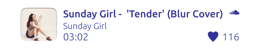
Anatomy of a card
Cards themselves are also very flexible and will adapt their layout to the amount of components you want them to display.
As seen before, a number of predefined components can be used. Here is an example of a result card using most of them :
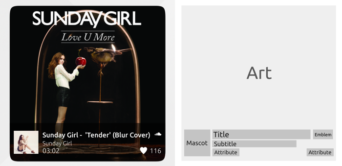
- Art : Image file, local or remote
- Mascot : Image file, local or remote
- Title : Up to two lines of text
- Subtitle : One line of text
- Emblem : Image file, local or remote
- Attributes : Text and/or icon. Up to six attributes laid out on two lines.
- Summary : Up to five lines of text
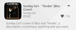
Here is the same card with a different layout : “horizontal” with a “summary” component and no “mascot”.
For emblems and attribute icons, symbolic svg icons will use the ForegroundColor of the scope.
Going further
Scope flexibility is here to unlock your creativity : try to push the customization to its maximum and make your scope unique. Have a look at default scopes such as Ebay, Wikipedia or Youtube to get some design ideas !
You can dive into the API documentation if you need more details on tweaking cards and categories to your needs.