 Ubuntu Phone documentation
Navigation
Consistent and effortless navigation is an essential element of the overall user experience.
Usage
Before building your application think about the overall structure and organize the content considering the device layout and navigation that will need to happen.
Grouping content
Categorizing content and elements into related groups will allow the user to easily scan and perform actions within your application in a way that is logical.
Signposting
Signposts are recurring UI elements that help indicate to the user of where they can go to reach their goal within your app. Using the same elements throughout your interface will create a familiar environment for the user and minimise their learning curve.
Structure
Structure your app by organizing the content into a logical hierarchy.
-
Overview – the most accessible features you want the user to have instant access to, such as a list of emails.
-
Top level – filters of the overview, such as threads or recent emails.
-
Lower level – detailed views that show detailed information, such as contact information.
-
App settings – a place for the settings of your app, such as notification settings for receiving emails.
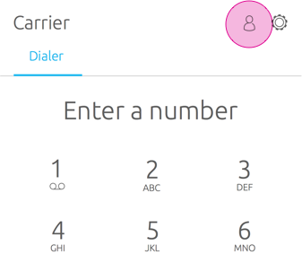
Overview – Dialer
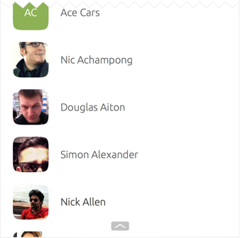
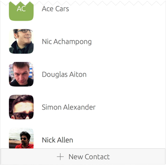
Top level – Contacts
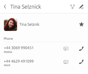
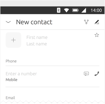
Lower detailed level – Contact information
Page stack
A typical structure may consist of one or more top level views, with detailed views on a lower level. Page stack navigation allows user to drill down from the top level to the detailed views through actions and navigational options within your UI.
On mobile devices, only one page is available at once. Once a page is chosen, the page will stack over the previous page. A Back Button will appear in the header to take the user back to the previous page if they wish.
Page stack in a multi-panel layout
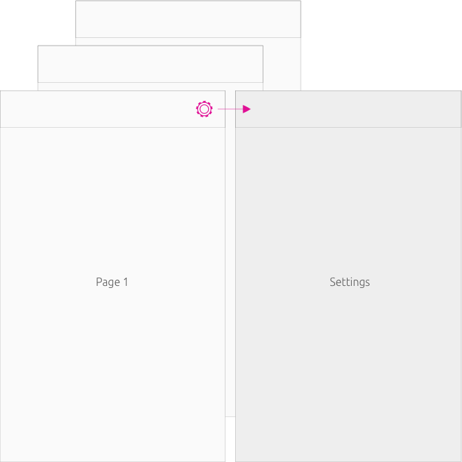
Larger screens provide more screen estate for two or more panels to be visible at once. There are two ways page stack behaves depending on which panel the action is placed in.
Page stack over both panels
If an action is triggered in the leftmost panel, then the page will takeover all panels.
Page stack over the right hand panel
If an action is triggered in the rightmost panel, then the page will stack over the same panel.
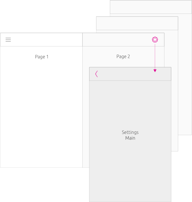
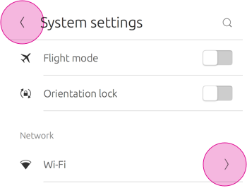
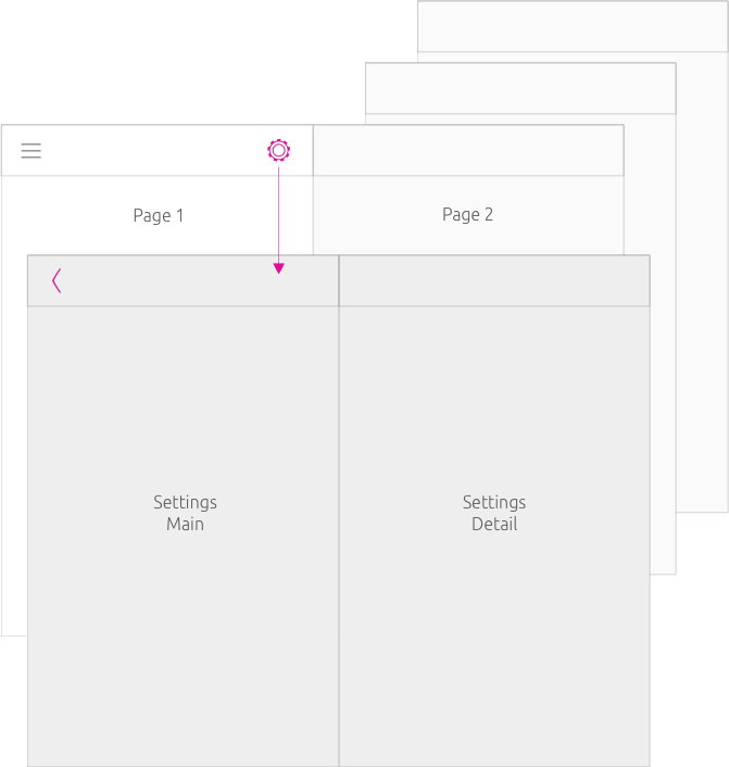
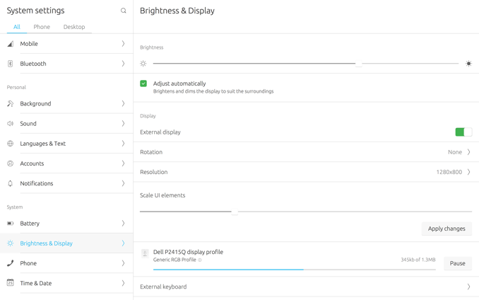
System Settings – right panel view change
In this example, ‘Brightness & Display’ has been selected inside the left panel and takes over the rightmost panel view.
Components
The Ubuntu toolkit provides a variety of components that can provide navigation within your application.
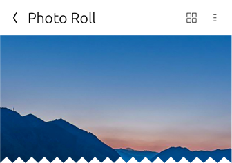
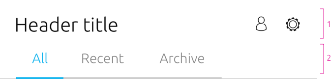
Header
Use the header to contain the most important actions and navigational options inside your app. This allows the user to know where they are and what they can do.
Slot arrangement
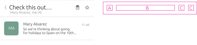
The header features a maximum of four slots that can be arranged and combined to fulfills the user needs.
Slot Navigational option
A
-
Back – use to navigate to a previous page of the app (if other pages are available)
-
Navigation drawer – use to store more pages if there is no room in the header
B
-
Title (mandatory) – provide a one line title of the app or view
-
Subtitle (optional) – extra explanatory text up to two lines
C/D
-
Search – use to search for specific content
-
Settings – use to navigate to your app’s settings page
Use drawers sparingly because it:
-
Hides pages and actions from the user
-
Conflicts with the Back Button
-
Requires a tap to see available pages/or actions and two taps every time a user switches pages.
 |
A Back Button would be irrelevant if your app only has one page, because there would be no pages to go back from; so it is not required. |
|---|
Headers in multi-panel layout
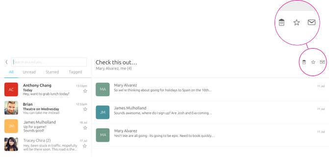
For a multi-panel layout, such as on a desktop, each panel can display its own header, which can contain additional slots because more real estate is presented. This can be useful to reveal actions or views that were previously hidden in drawers in a single panels screen, like on mobile.
More actions revealed
In this example, Dekko displays an action for the bottom edge, search and settings inside the lefthand panel, and in the rightmost panel it shows a delete, favourite and messaging.
 |
For more slot layout examples see Header |
|---|
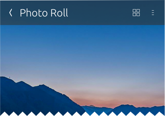
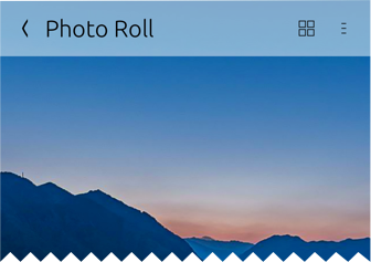
Header appearance
You can decide how you want the the header to appear in four ways: Fixed, Fixed and Opaque, Fixed and Transparent, Hidden.
Fixed (default)
Useful for making section or action always accessible for when the user scrolls.
Transparent
Useful if you don’t want the header to be the focus of attention, but want it readerly available if the user needs it.
Hidden

Useful for full-screen applications, such as the Camera App.
Overlay
Useful to display more content in a single screen.
Customised header
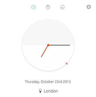
If you choose not to have a header, then think of how users will navigate through your UI in a different way.
Overview
Top level
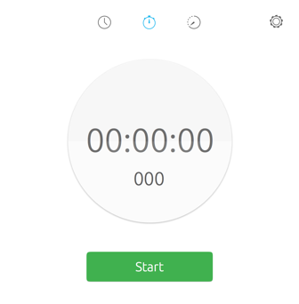
For example, the Clock app has a customized header where it uses icons at the top of the screen to take the user to different levels of the app.
Header sections
The header section allows users to easily shift between categories views within the same page. If the main header is set to default, then the sections will slide away when the user scrolls down.
-
The main header is a separate component that can hold actions and navigational options.
-
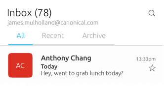
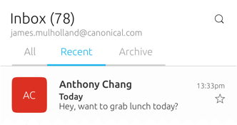
The header section sits below the main header and allows for sub-navigation or filtering within the screen indicated by the header above. One option is always selected.
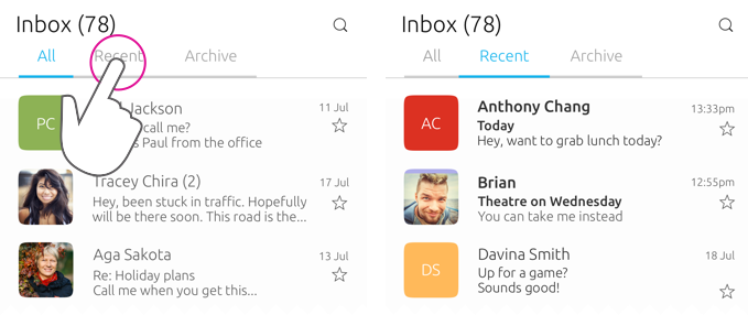
Dekko app
For example, if your app was presenting an inbox of emails, from ‘All’, the sub-sections could display ‘Recent’ and ‘Archive’ to further filter the content for the user. More section on the screen can be visible through swipe or clicking the hint that appears when a mouse is attached.
Pointer environment
More tabs are indicated by an arrow revealed when the pointer hovers over it.
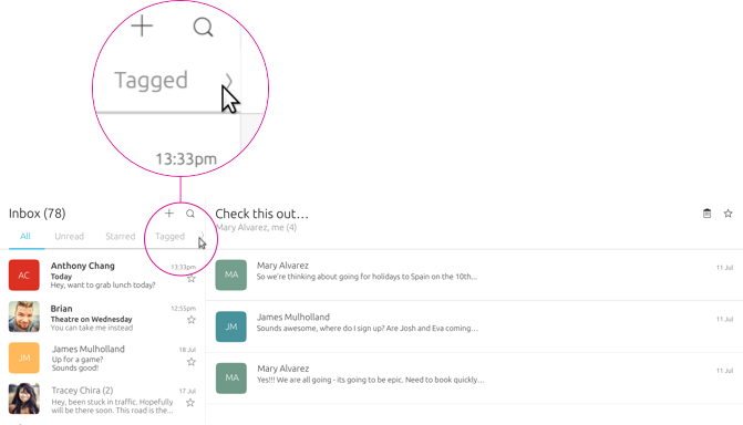
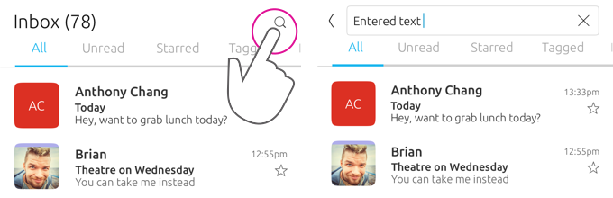
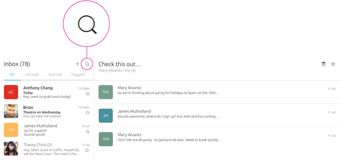
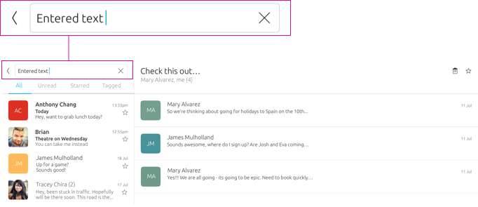
Search in the main header
You can use search within the main header for an additional filter for your application; or as a global search. Search is invoked in a similar way in a touch and pointer environment by tapping or clicking on the search icon.
Multi-panel layout
Bottom edge
The bottom edge is specific to your application. It can give users quick access to the most important actions within your app, or a related view from the bottom of the screen via a hint (on touch), or from an action inside the header (pointer).
When the bottom edge is revealed the page stacks over the previous page and a chevron pointing down appears in the header to allow the user to go back to the previous page.
Hint 1
Appears on application launch to hint to the user that there is a bottom edge available.
Hint 2
The bar is revealed after Hint 1 has been interacted with.
Reveal

Once the user starts to swipe up from the hint. The new view starts to be revealed.
New view
A new view stacks over the previous page once the user has committed to the swipe.