 Ubuntu Phone documentation
Components
These are the building blocks that allow you to create a consistent and structured scope.
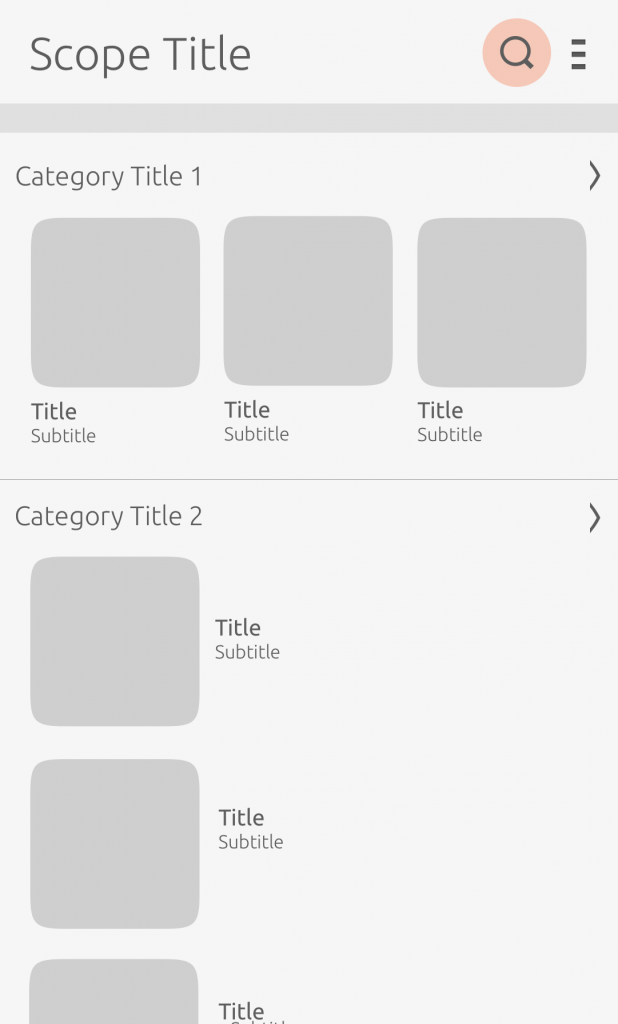
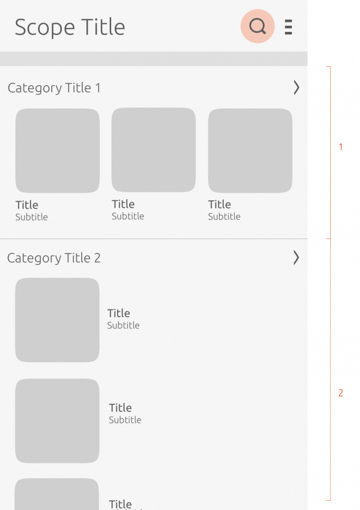
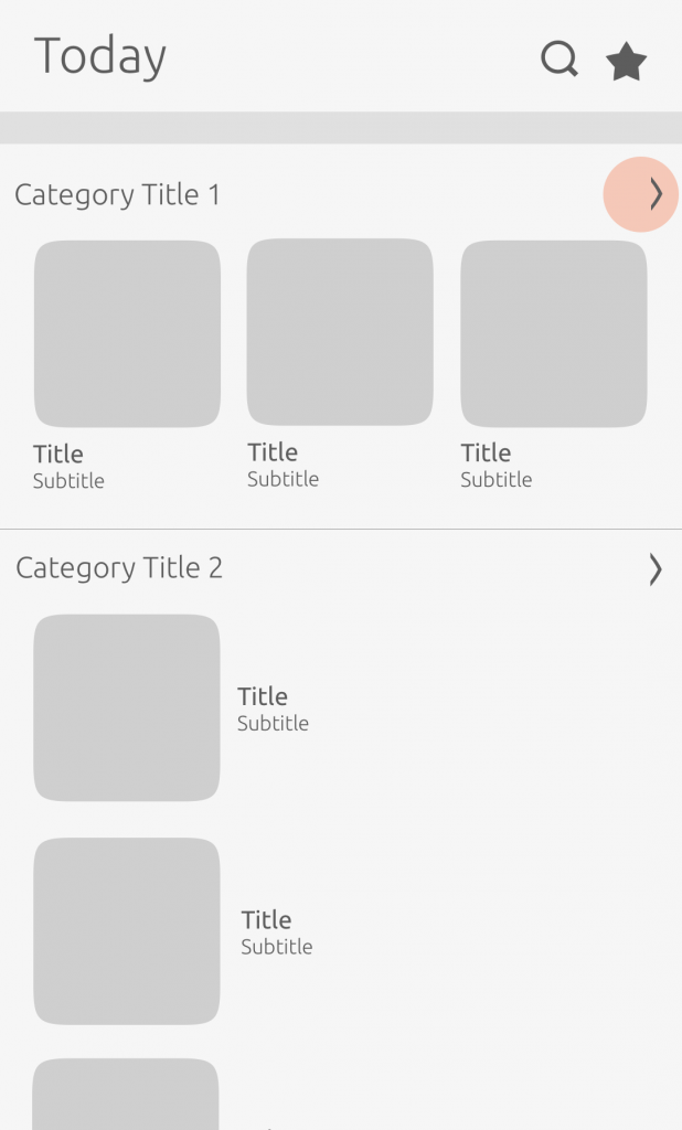
Scope header
We use the scope header for navigation purposes and placing actions.
Scope title
The scope title can be represented in two ways.
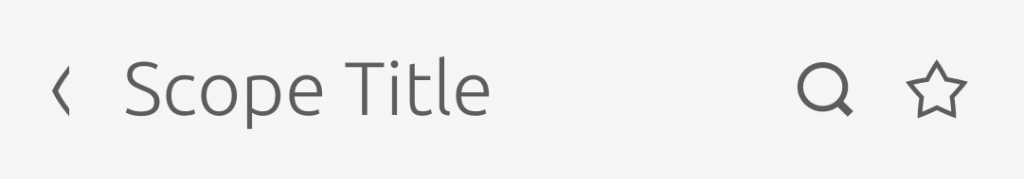
Text: Scope title
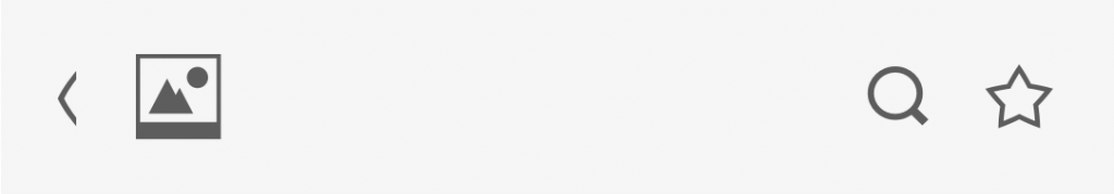
Artwork: Scope logo
Placing actions
The header consists of one text string and optional monochromatic icons.
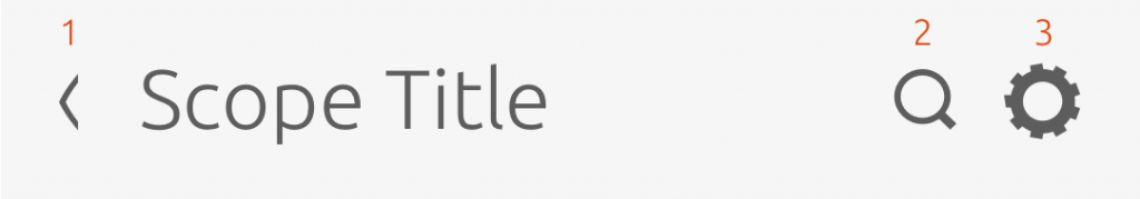
Actions
-
Back – used if the scope is opened via tap from an installed aggregator scope.
-
Search – allows the user to search across the scope and connected branded (single service) scopes for a specific query. It should always appear first after the scope title.
-
Settings – enables persistent settings for simple customizations, such as enabling the user’s geographical location to receive local content sources.

Arrange your header to maximize the important actions inside your scope, such as using a search icon for users to reach a specific result.
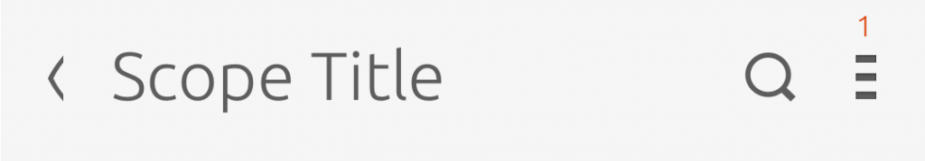
Burger menu
- When more than three actions are placed in the scope header e.g. favorite, settings and search – a burger menu is used on the right to store two of the actions.
We recommend you use the burger menu sparingly, as it hides away views and actions from the user.
Header search
On a search results page, the returned results should be ordered by relevance, which is defined by the scope author.
Search icon
The user can search for a query via the scope header.
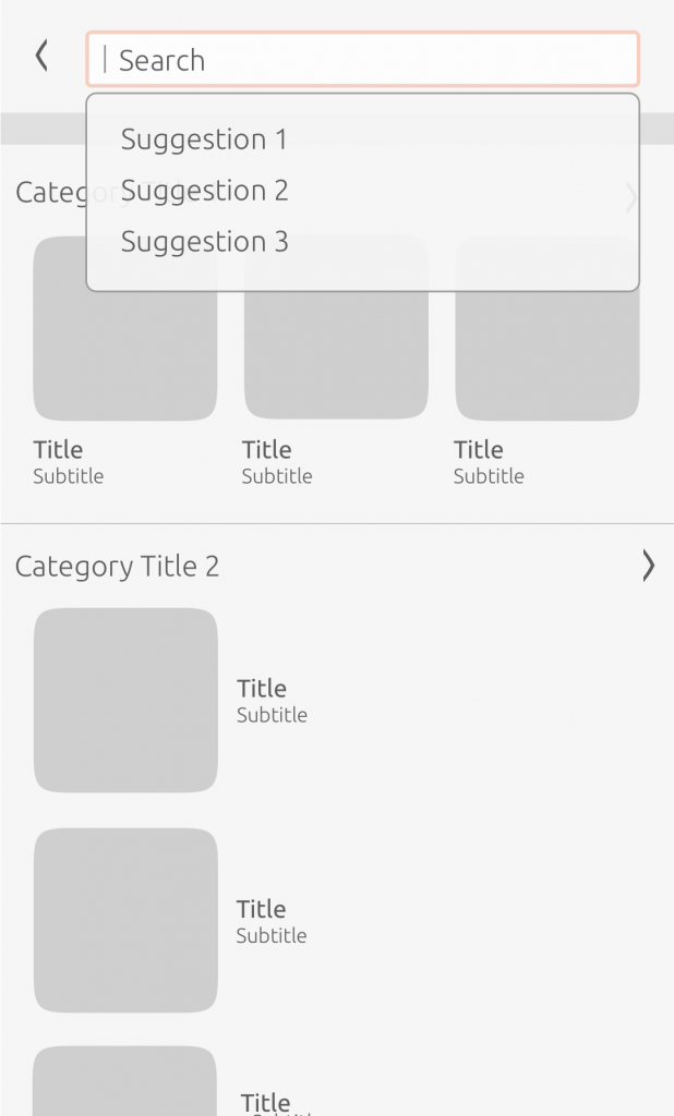
Suggestions
Once the user starts to write a query, suggestions will appear in a drop-down menu with related results.
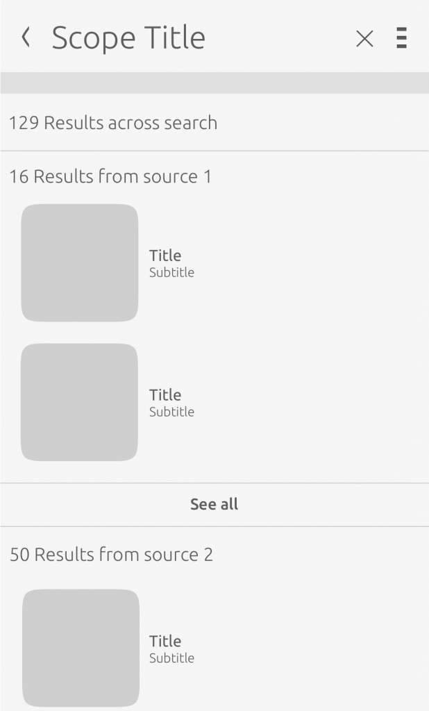
Results page
Once the user has committed to a search, they will be presented with results taken from connected single service scopes.
The user can tap the cross in the header or the back chevron to be taken back to the scope home screen.

Implement the SearchReply element from our SDK, which allows the results of a search query to be sent to the query source. Also see: SearchListenerBase, SearchMetadata and SearchQueryBase elements.
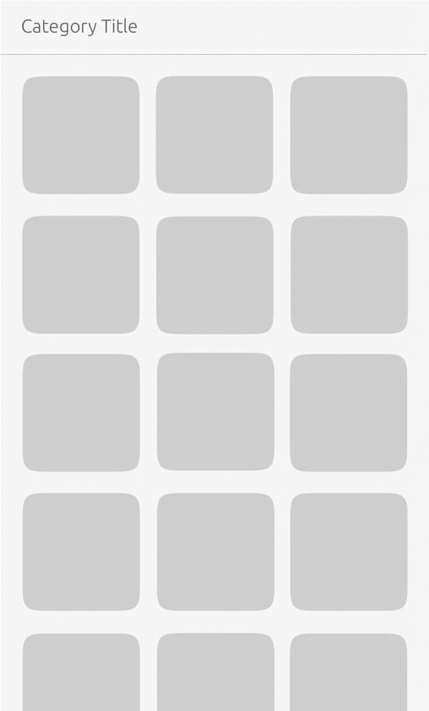
Categories
Categories are used to group together related content in a readable and manageable way.
To implement the Category and Categorised Result element in your scope see our SDK.
Structure
Structure your scope according to the user’s activities, and group cards in categories to help them find related results.
-
Personal data – this displays the user’s local data on their device. For example, it could display the user’s ‘Recently Played’ music from their personally stored music.
-
Online service accounts – this displays the user’s connected online service accounts. For example, the Music Scope will display the user’s likes from their SoundCloud account.
Think about what the user will first expect to see at the top of your scope. If your scope is selling products, for instance, you may want to use the top category as a promotional banner.
Implement a JSON formatted template with the Category Renderer from our SDK.
Category header
Headers can let the user know what is available inside any given category.
Header
A category header can consist of one text string and optional monochromatic icons. They can also link elsewhere in the scope or to a branded (single service) scope.
No header
No header categories can be used for in-scope promotions – aka “banners”. They still have header titles that are shown in the index/collapsed view.
Header links
Where we use links inside a category header, the header should be clear as to where the user will be taken.

See more ways in which the header can link to either a website or an app in the Navigation section.
Implement a Hyperlink(label and canned query) from our SDK.
Designing categories
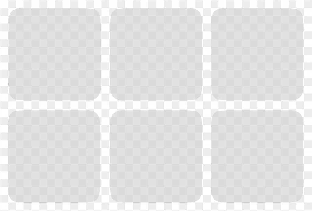
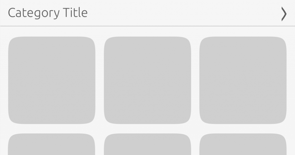
Grid
The cards are shown in a grid form where they are fixed at the same height.
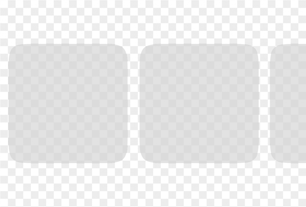
Horizontal-list
The horizontal-list layout allows users to scroll horizontally to view more results.
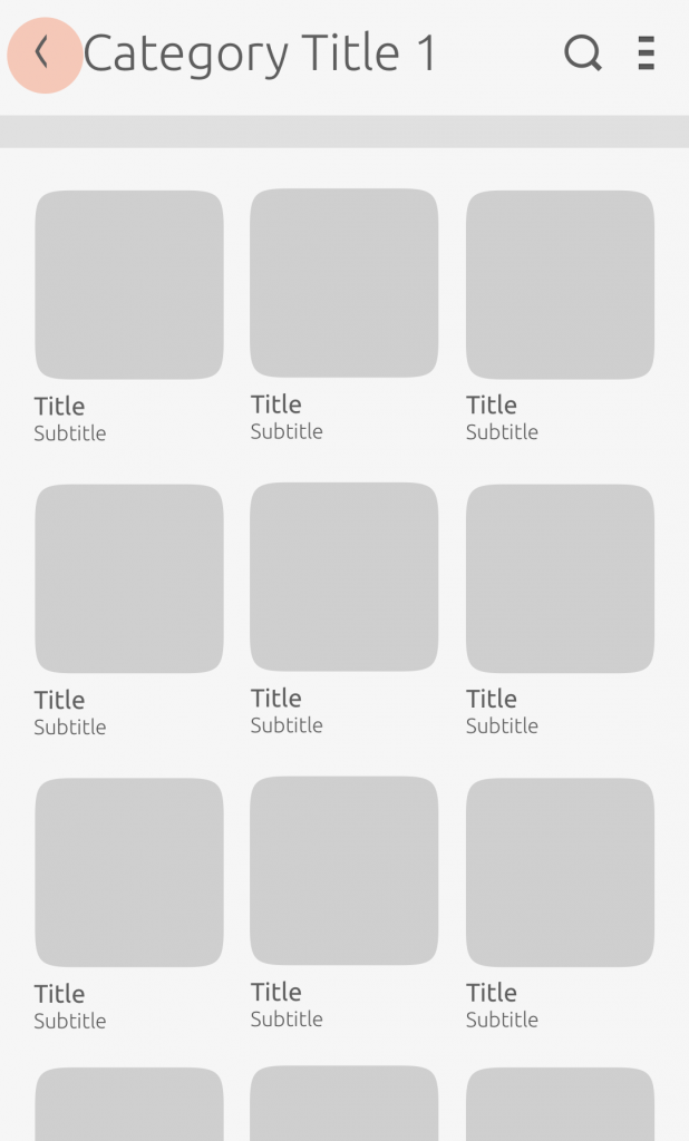
Category expansion
A category header can assume a collapsed or expanded state; without a header, it is not expandable.
It is useful to condense the amount of content on the screen, so the user can browse content in other categories.
In a full expanded view, all cards are presented on the screen.
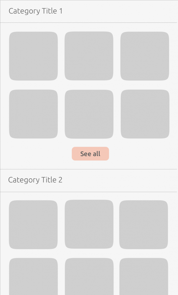
In its collapsed state, ‘See all’ displays more cards.
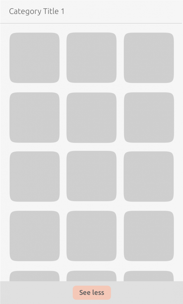
When the category is in the expanded state, ‘See less’ closes the category back to its original collapsed state. In the expanded state, only the ‘See less’ button is visible.
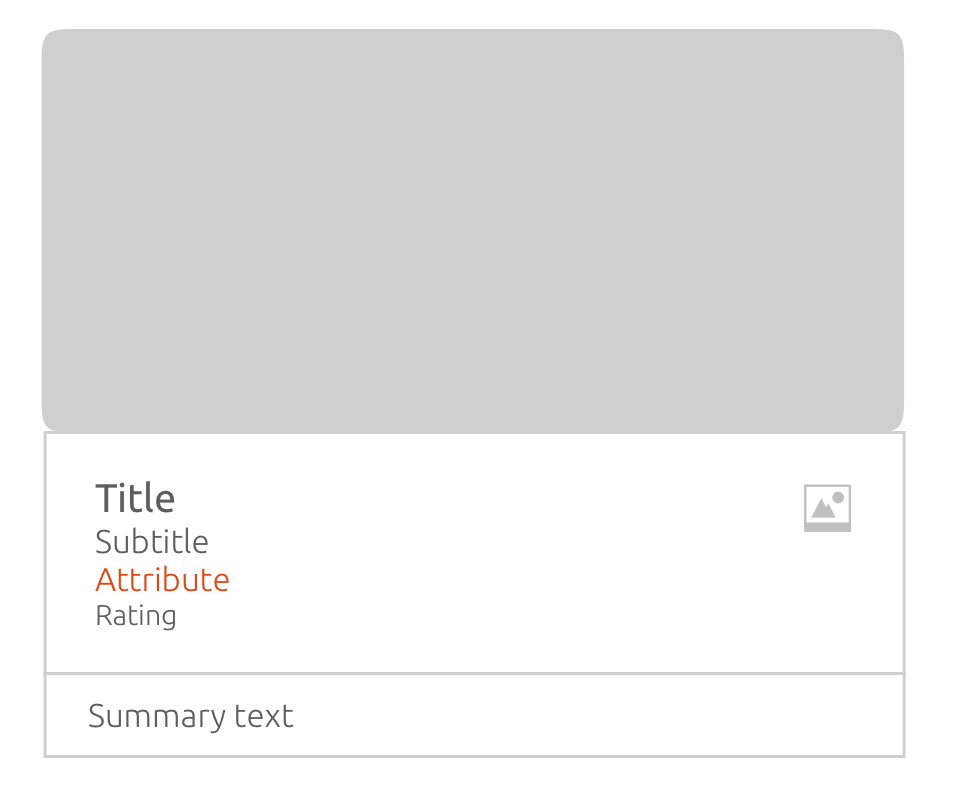
Cards
A card is a visual representation of a content result; you can design them in different layouts and use the given components to enhance their readability.
Implement the Result element from our SDK, which contains the attributes of a result returned by a Scope.
Card components
There are three components available to create your card, these can be arranged to best suit how you want your results to be displayed.
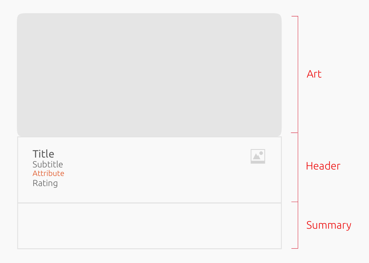
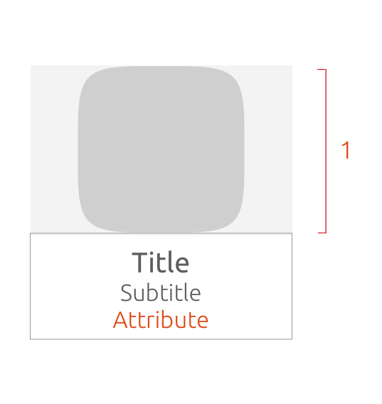
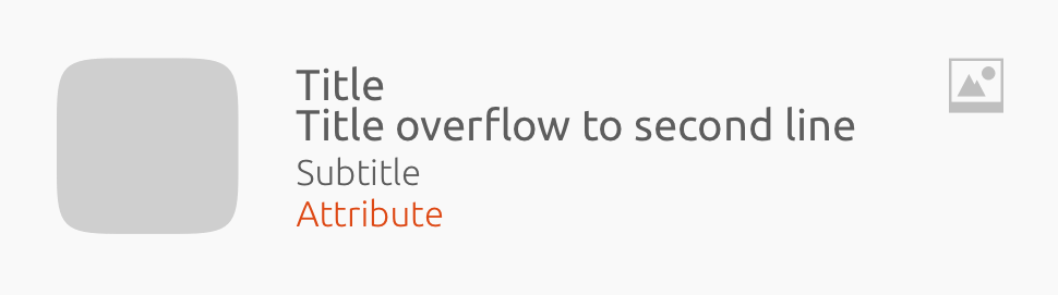
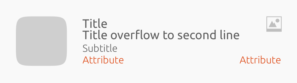
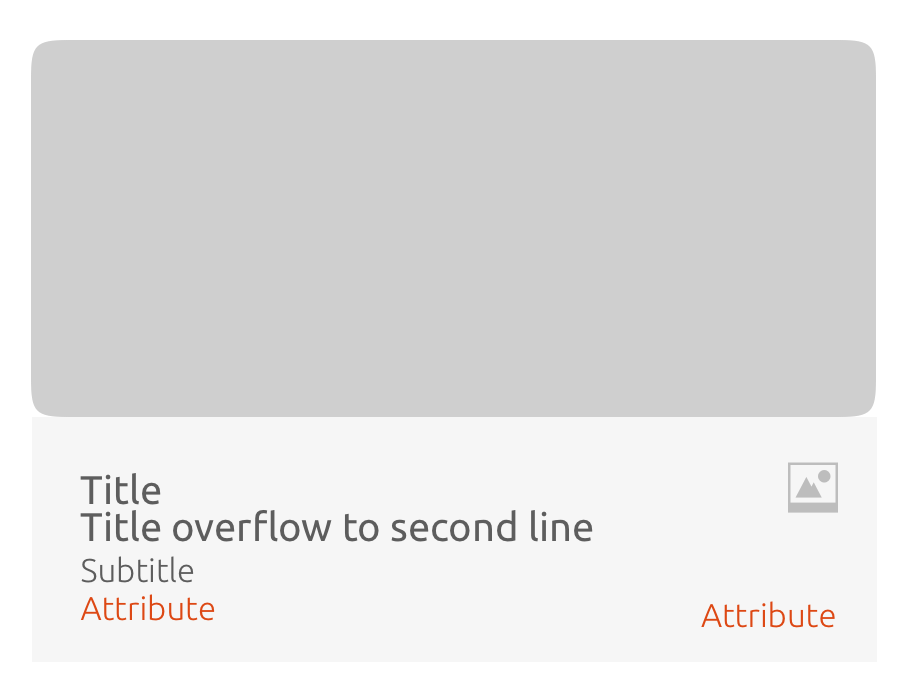
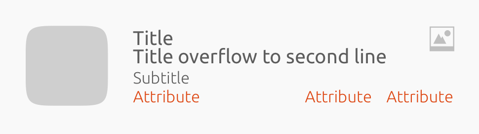
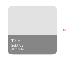
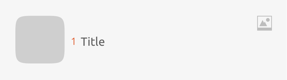
Card art
The art can be an icon or a thumbnail.
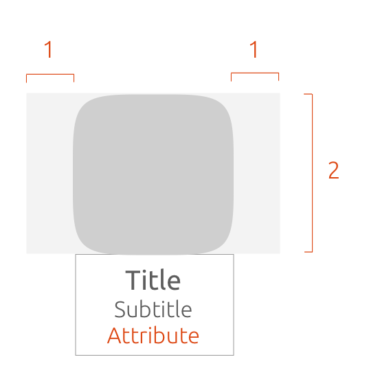
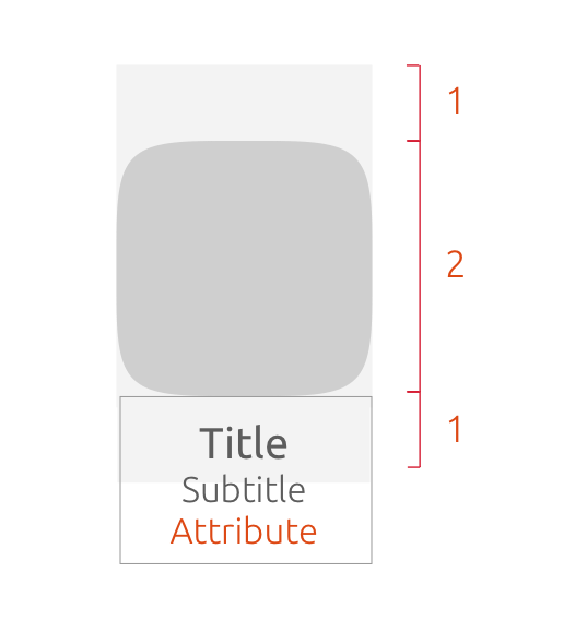
Art size
The art mask defines the maximum size of the art (image) within a card.
Depending on the context of your card, you might want the art to take centre stage, or just be a visual aid to the content.
Horizontal
1.2
The art-mask width equals art-mask height.
1.3
You can define the art-mask height to the width, within a range from of 3:1 or 2:1.
By default, the art-mask width equals the art-mask height on a 1:1 ratio.
Vertical
Vertical
The art-mask width = card width.
By default, the art-mask height equals the art-mask width on a 1:1 ratio.
Crop your art within the art-mask
If your art does not fit in the mask, it will be cropped.
-
Image cropped area
-
Image fills art-mask
You may choose to scale the art proportionally with the largest aspect of the art scaled to fill the art-mask.
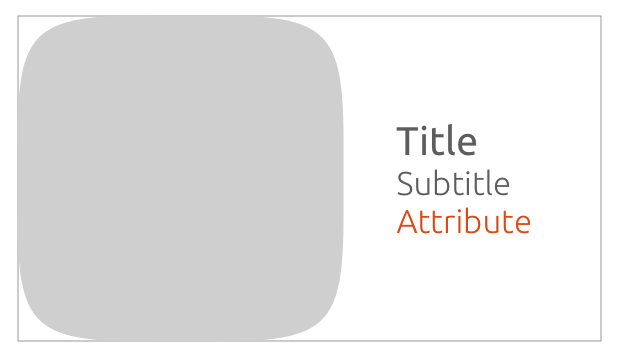
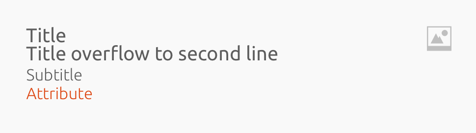
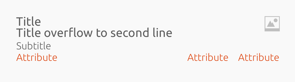
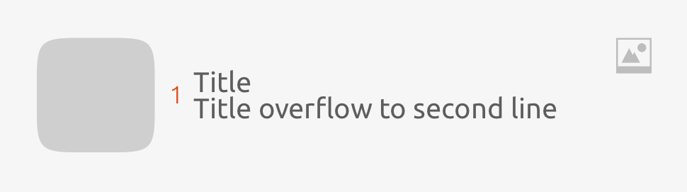
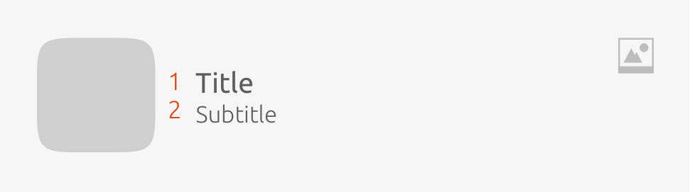
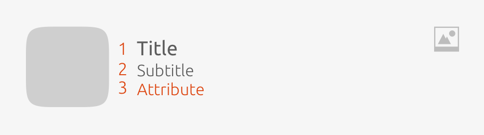
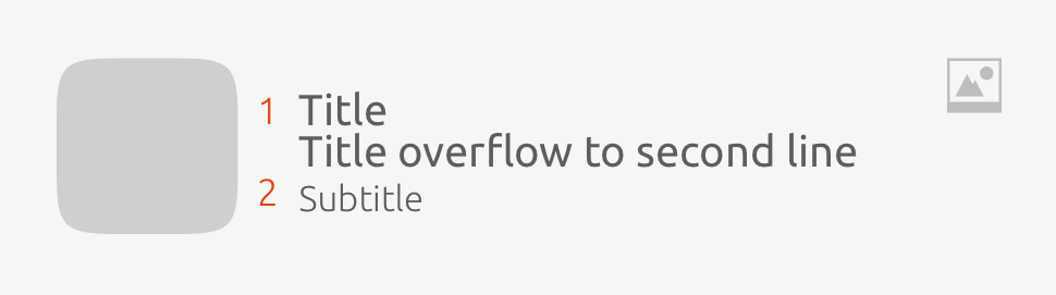
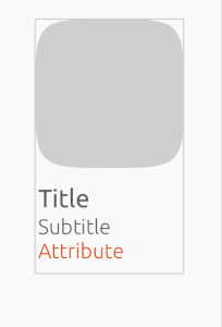
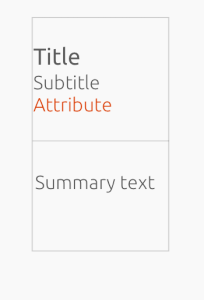
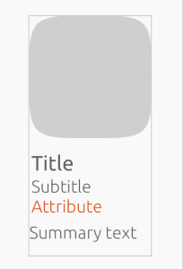
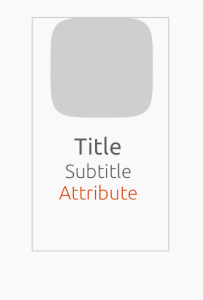
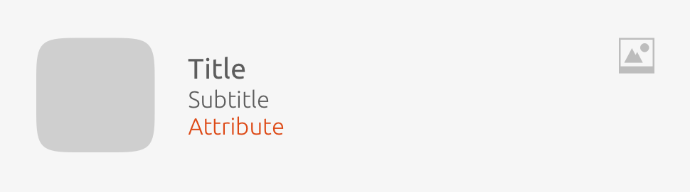
Card header
The header can display up to seven elements. You can configure the header to best represent the content displayed. However, you cannot change the ordering of elements or redefine element formatting in any way (i.e. font style or size).
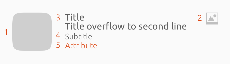
Elements
-
Mascot/Avatar – You can use a mascot (avatar) to accompany your title; it acts like a thumbnail.
-
Emblem – An emblem can be displayed to the right of a title where it is fixed to the height of the title row.
-
Title – A title is the only element that has a possible variation, as it can flow onto two lines. If it should go over two lines, then it will be cut off with an ellipsis.
-
Subtitle – A subtitle can only use up one line.
-
Attributes – These include price, rating and scale, which should fit in the allocated space provided.
Attributes
An attribute can either be an icon or text, or both.
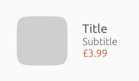
Price
Is a text string with a predefined star icon.
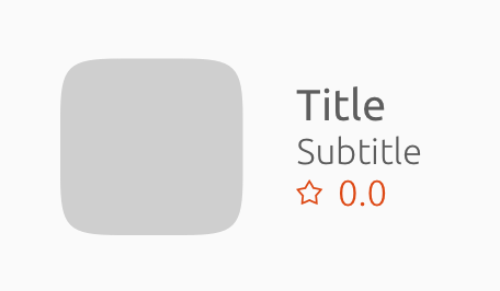
Rating
Is a text string with a predefined star icon.
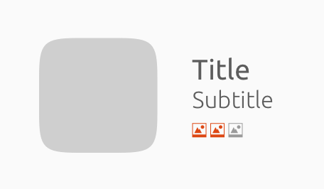
Scale
Can be a text string with an icon that you can provide, or you can choose from our predefined set of icons.
Placement
The three attributes can be arranged and combined in a number of ways.
1. attribute
2. attributes
3. attributes
Headers can overlay art
The header will have a dark overlay and the text will be white.
When a header is an overlay, it should not include a mascot.
Header text styles
The title, subtitle and attribute can be shown in certain font weights and sizes.
1
2
3
4
5
1 2 3 4 5
Font weight Regular Regular 1.Title: Medium
2.Subtitle: Light 1.Title: Medium
2.Subtitle: Light
3.Attribute(s): Regular 1.Title: Medium, 2.Subtitle: Light
Font size Small Small 1.Title: Small
2.Subtitle: Extra small 1.Title: Small
2.Subtitle: Extra small
3.Attribute(s): Small n/a
Padding between text baselines n/a n/a
1.5GU 1.Title: >1.5GU
2.Subtitle: 2GU 1.Title: >1.5GU
2.Subtitle: 2GU
Alignment Left/Middle Left/Middle Left Left Left
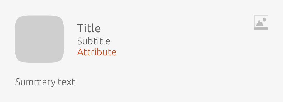
Card summary
Text can be split into paragraphs.
-
If the text is up to 5 lines, than the last line of text will be replaced with ‘See More’, where it will show in the preview – which appears once the user has tapped the card.
-
Up to 5 lines of text can be placed in the summary component.
-
When a card includes a summary text, then the background to the header and summary should be white.
You cannot redefine the summary text formatting in any way, and it cannot be used with a small card template.
Summaries are great for showing glimpses of news stories or reviews.
Card size
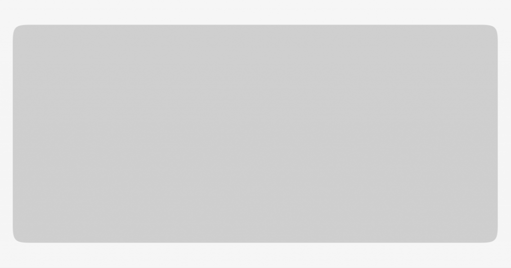
Large
One card is 38GU in a 40GU device – leaving a 1GU margin. It is also available on phone, tablet and desktop.
Useful for banners or displaying previews.
Medium
Two cards are 18GU each on a 40GU device – leaving a 1GU margin on a narrow space of a device with 40GU – each card is 18GU with a 2GU margin.
It is also available on phone, tablet and desktop.
Useful in displaying previews of a news stories.
Small
Three cards are 12GU each on a 40GU device – with a 1GU margin. It is available on devices smaller than 60GU width.
Useful in displaying music art and track titles.
On bigger form factors, a small size is automatically converted to a medium size.
Designing cards
There are two classes of card template: vertical and horizontal.
You must choose a card template that is compatible with the category layout. In case of layout errors, we try to gracefully fall back to defaults.
Vertical
Art, Header and Attribute
Art
Header, Attribute and Summary
Art, Header, Attribute and Summary
Small Art, Header and Attribute
Category layout Grid Horizontal-list
Header overlay No Yes
Grid size S. M. L S. M. L
Horizontal
Art, Header (Emblem on the right) and Attribute
Art, Header (Emblem on the right), Attribute and Summary
Category layout Grid Horizontal-list
Header overlay No No
Grid size L L
Inside a shape No No
Placing components
One card displays one result (data/content item). It is made up of a maximum of three components:
-
Art (of varying types and sizes)
-
Header (one or more title text fields)
-
Summary (additional info, ratings, associated buttons, etc)
One component must be present in any given card.
One configuration
You can have the art on its own e.g. a promotional banner.
Maximum configurations
Can be the art, header and summary together.