 Ubuntu Phone documentation
Context menus
Use a context menu to provide quick access to important actions within your application.
Overview
The toolkit includes convergent menu components that can be applied across all devices to provide a shortcut to the most relevant actions within your app.
A context menu can contain shortcuts to primary actions or commands that are relevant to the user’s current context.
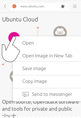
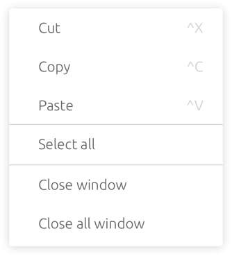
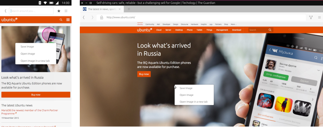
Staged
A contextual menu reveals relevant commands using long-press, such as saving an image in a web browser.
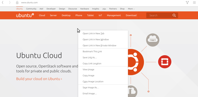
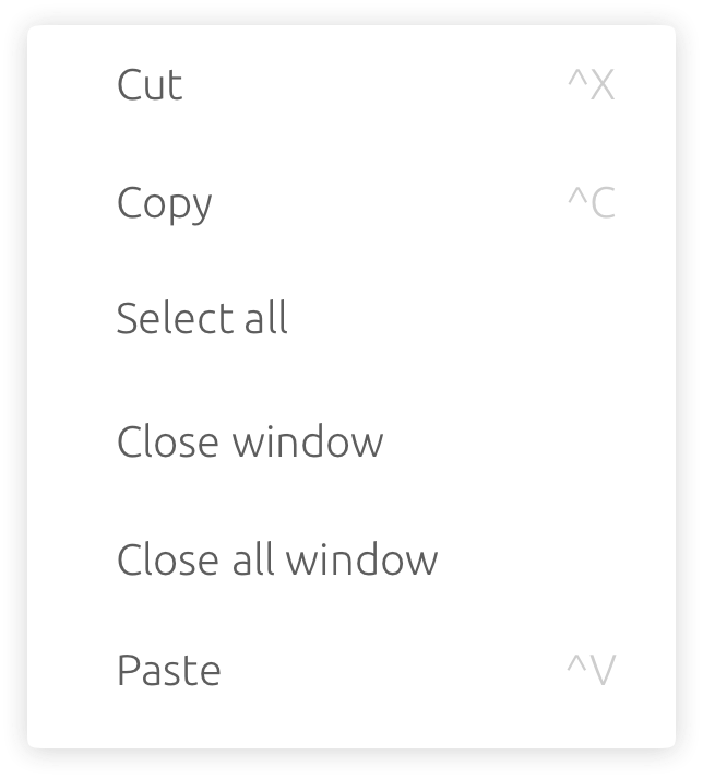
Windowed
The same context menu appears with more commands when a user right-clicks on a web image.
 |
See how context menus behave in List items. |
|---|
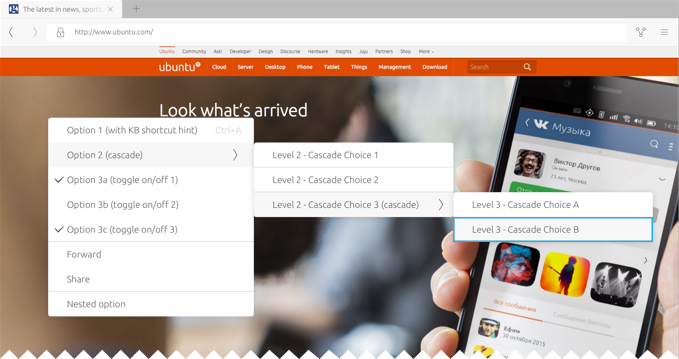
Cascading menus
Cascading menus act as sub-menus within your main contextual or application menu.
 |
Try to limit nesting to one level deep, because it can be difficult for the user to navigate through multiple nested submenus in staged environments. |
|---|
Use case
Larger screen (tablet, desktop)
Revealing actions
Touch and pointer interactions perform the same functions for familiarity and consistency across convergent devices.
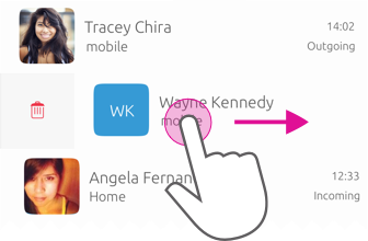
On a touch screen, a context menu is revealed by long tapping or swiping the list item from left to right. Swiping right may reveal a button for the leading action, such as ‘Delete’ or similar. Swiping left may reveal buttons for up to three other important actions, which are the trailing actions. When a pointer device is attached, right-clicking an item will reveal the context menu, and click and drag will reveal the leading and trailing actions either side of the item – giving the same experience as swiping.
Context menu
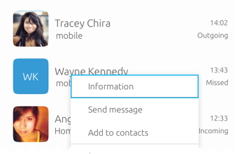
For medium to large screens, long-press (touch) and right click (pointer) can be used to reveal a context menu. For instance, if you have a touch screen desktop monitor, you can long press a list item to reveal a context menu, or if you have a mouse connected then you can right click.
Right-click
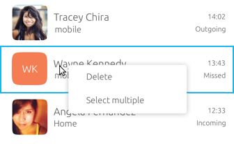
Long-press
Focus
Leading and trailing actions
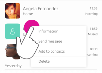
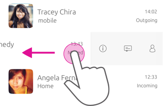
On smaller screens, such as mobile, users reveal leading and trailing actions by left or right swipe. The trailing actions will contain the same contextual actions as the context menu on right-click. If there are more than three trailing actions you can provide an overflow menu inside the header, or inside the list item itself.
Swipe right – Leading action
Swipe left – Trailing actions
|
For more information about leading and trailing actions see List Item. |
|---|
Layouts
It is important that each menu retains a consistency in its layout and content when used across different devices.
-
Select item
-
Region
-
Window
-
Application

Do
Place the most frequently used menu items at the top of the menu. Use sentence capitalisation for each command name.

Don’t
Place negative actions close to positive actions, because users may accidentally trigger them.
Menu items
Each menu is made up of a set items that can include text or an icon, or both, to best display your menu items.
Text labels
It is important that you accurately describe the associated action or option in a succinct manner when using text labels inside your menus.
Do
Be concise and clear to avoid confusing or misinforming the user.
Don’t
Use over-long text labels that result in truncation (…).
|
By default the SDK applies a truncation to long text labels, therefore avoid placing them manually. |
|---|
Label examples
-
Add
-
Edit
-
New (rather than ‘create’)
-
Move
-
Save/ Save As
-
Delete/ Remove
-
Send
-
Share
Grouping menu items
Items should be grouped in a logical manner using dividers to separate related actions that have been grouped together.
Do
Don’t
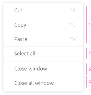
Divide a predictable set of commands, such as clipboard commands (Cut, Copy, Paste) from app-specific or view-specific commands.
Placing actions
In cases where editable or configurable groups of similar items are presented to the user (for example, editing a List of contacts or a Grid of application icons) actions are placed according to the user’s interaction with the item.
The top three actions inside your menu will appear as trailing actions when the user swipes right. Destruction actions inside the menu, such as delete, will be available as a leading action when the user swipes left.
|
Developer can choose to input a burger menu to store the actions inside the header rather than inside the list item, if they wish. |
|---|
Avoid duplicating actions
Actions may be present within the app menu and elsewhere within the interface, such as actions within a toolbar. Care should be taken to ensure that duplicate actions are as relevant and useful as possible and represent a small, highly-relevant subset of the actions available.
When the user is using touch, the most primary actions are placed inside the header area. Other actions specific to a set of list items can be found using swipe where possible. Care should be taken to avoid duplicating actions that appear in the header area within contextual actions menus.
Disabling actions when inactive
Rather than removing the item completely, show the user that the action exists by disabling it within the menu, when applicable.
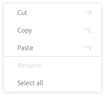
In this example, ‘Rename’ is greyed out in order to indicate to the user that it is not possible to select this option at this time (as no name has been given).
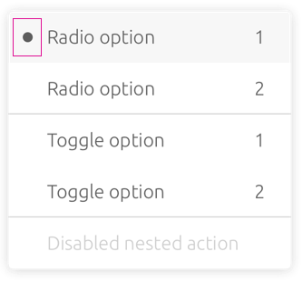
Flag gutters
The Flag Gutter will always be present in the context menu in order to allow flags for toggle or radio actions to be displayed. For example, if you want the user to make a selection from your context menu, you can add checkboxes for multiple selections within the flag gutter.
|
For more information on checkboxes and radio buttons see Selection controls. |
|---|
Behavior
Keyboard shortcuts
Keyboard shortcuts allow users to quickly perform an action or navigate through your UI. Many shortcuts are inherently familiar to the user and should map precisely to the relevant action or option that appears within your menu.
Shortcut Function
Ctrl+C Copy the selected text/object.
Ctrl+X Cut the selected text/object.
Pinch close (two finger) Zooming out on content.
Long press (one finger) Start selection of content or item.
Rotate (two finger) Moving around a centre point simultaneously with two fingers.
Flick (one finger) Scroll in the direction you want the screen to move.
Long-press drag (one finger) To move, lift and rearrange content in a view or, in a multi-window environment, between windows whilst in edit mode.
Dismissing or closing menus
Once open, a context menu may be dismissed by either making a selection from the actions or by clicking or tapping anywhere outside of the menu area.
Keyboard input
The Escape Key (esc) will dismiss the contextual actions menu, as will as any user action that results in focus shifting away from the application.
Default positioning
Context menus should be positioned in a consistent and predictable fashion across all device layouts. This is to aid visibility and provide a clear touch target for when the user interacts with the screen with their finger.
Touch interaction
Context menus are centrally aligned on both horizontal and vertical axes.
Pointer interaction
Menu is aligned down and to the right of the pointing device cursor point at which the user right clicked or long-pressed.