Ubuntu Phone documentation
Gestures
Make the most of Ubuntu’s gestures to establish consistency and familiarity within your application.
Edge gestures
The edge gestures provide access to system features that work outside applications and cannot be overwritten. It is important to consider these edge gestures to avoid conflict with your own application gestures. For example, of you place a gesture from the top of the screen, this may cause conflict with the indicator menu that is revealed in the same area.
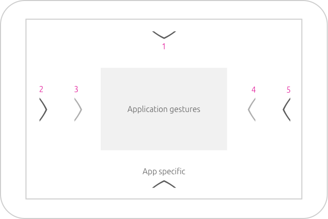
System
-
Top edge swipe reveals the indicator menu that contains settings and notifications when swiping down.
-
Short left edge swipe reveals favorited and frequently used apps from the launcher menu.
-
Long left edge swipe takes you back to the app screen (shows all the installed apps) when you are inside an application.
-
Short right edge swipe reveals the previous app used.
-
Long right edge swipe reveals an app stack to show all the apps that are currently open; like a stack of cards.
Application gestures
Application gestures happen within your application. It is how the user interacts with the content of your app with commonly used gestural activities like flicking, dragging and tapping within your application, such as selecting text to edit a message.
Application specific
The app specific area is reserved for the bottom edge, which can reveal actions or a view from the bottom of the screen.
Avoid using a stack of screens inside an app itself, because this would confuse the overall mental model of the system. Instead consider a two-dimensional model for your app, where you pan or zoom between screens.
Gestural activities
Certain gestures are associated with a particular movement of the finger and often come naturally to the user. Functions should map closely to the physical action implied by the gesture, such as flicking through content with one finger.
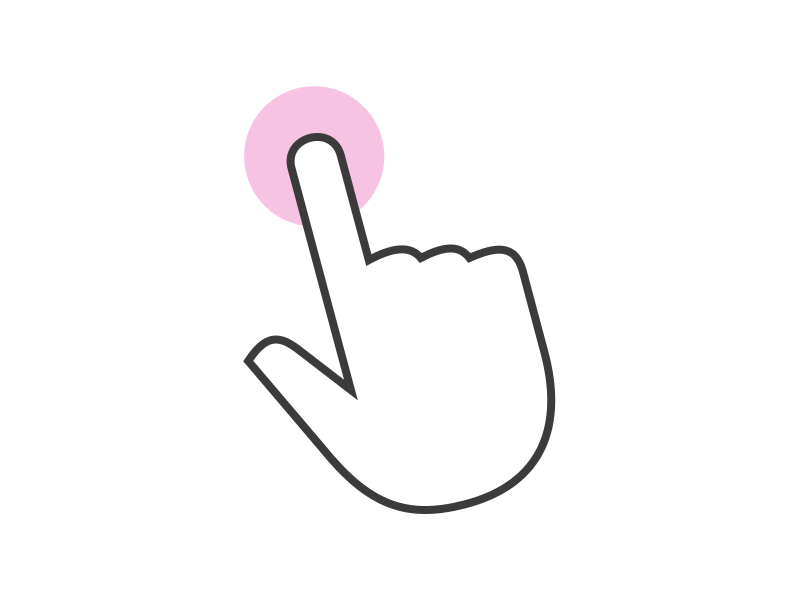
Tap (one finger)
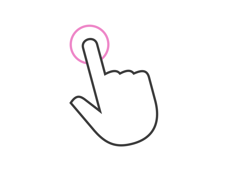
Use to activate a screen element, like a button.
Double tap (one finger)
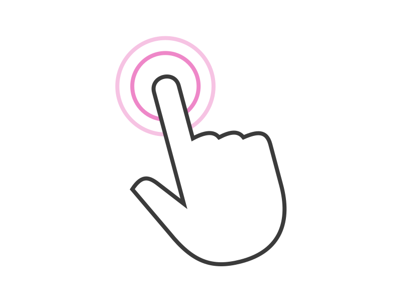
Use to double tap an item or select an area, such as selecting text in a message.
Long press drag (one finger)
Use to pick up, move and select multiple items.
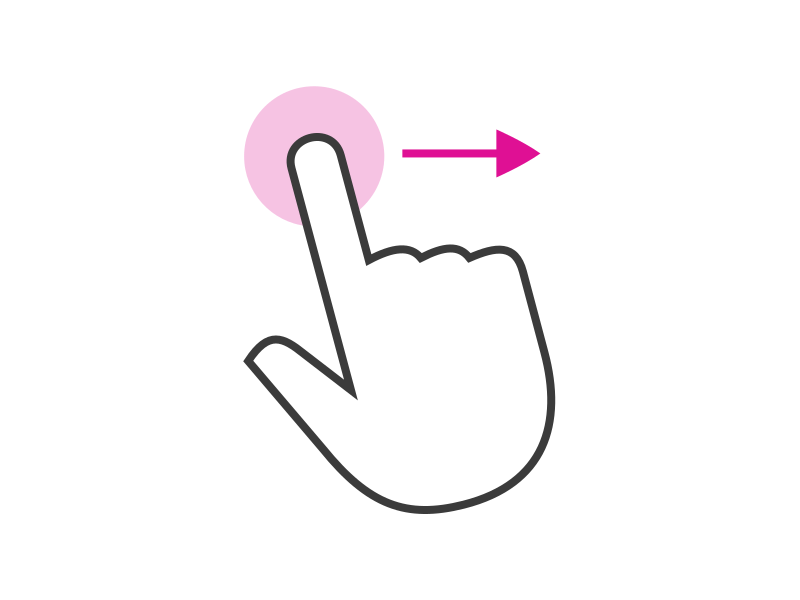
Flick (one finger)
Use to scroll in the direction you want the screen to move.
Long press (one finger)
Use to start a selection of content or an item within the application window, such as selecting a URL to copy in the Browser.
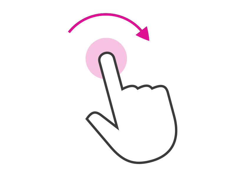
Rotate (two finger)
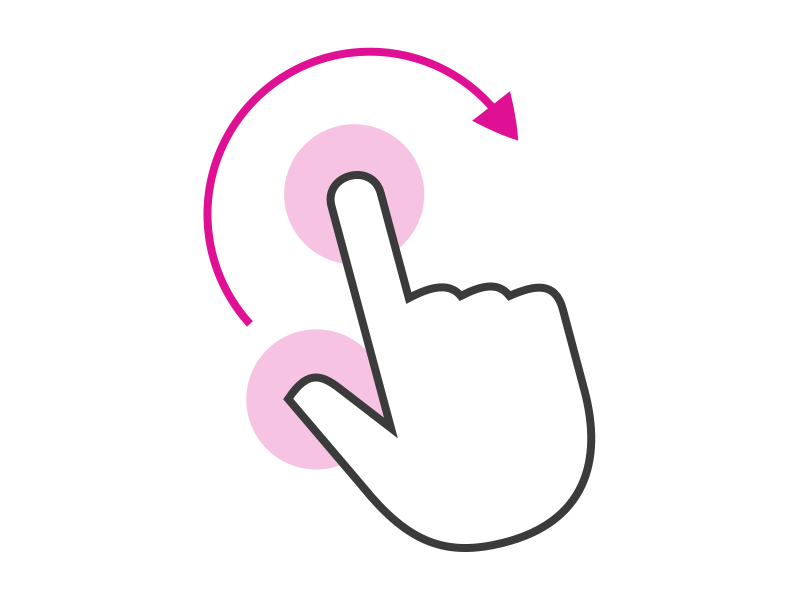
Use to move around a centre point simultaneously with two fingers to rotate an object, such as editing an image.
Pinch in or out (two finger)
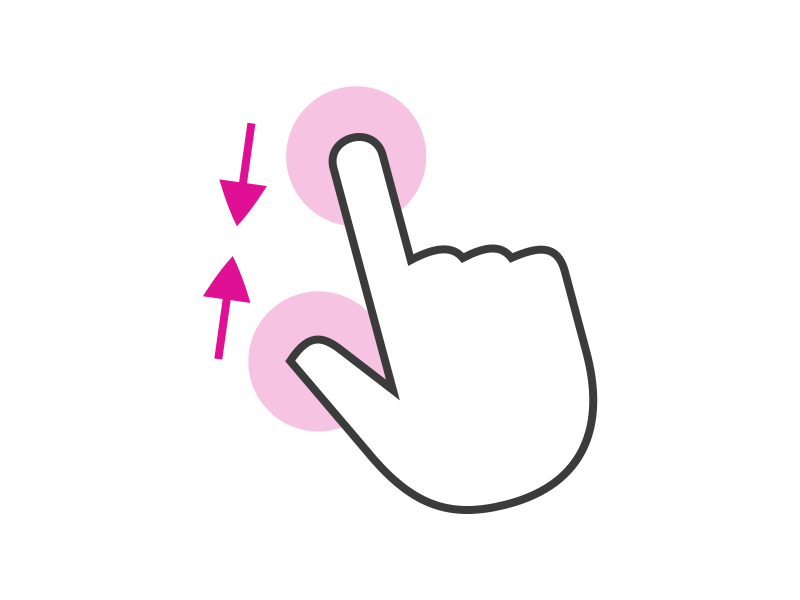
Use to zoom in or out of something, such as an image or a view.
Discoverability
Although functions should be intuitive, sometimes users may need a hand to discover new features within your interface.
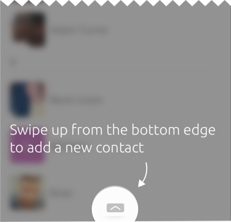
Bottom edge hint
The bottom edge is specific to your app and can be used to reveal the most important actions, or a frequently used view.
The bottom edge is made discoverable to the user by a hint at the bottom of the screen. This indicates to the user that there is a visible area by swiping up from the floating hint.
Hints
The bottom edge hint comprises of two elements: Hint 1 and Hint 2.
Hint 1

When your application is launched for the first time, the user will see a floating icon which is known as Hint 1.
Hint 2

After the user has interacted with Hint 1, the hint will morph to become Hint 2. This hint contains a label, icon or a combinations of the two. By using both a label and an icon it gives the user more detail of the content it will show, such as ‘ + New page’.
 |
For more information on the behavior of the bottom edge hint see Bottom edge. |
|---|
Instructional overlays
When the user initially opens your app you can guide them through the different features and gestures with instructional overlays to aid discoverability.
The SDK toolkit provides coach marks and tutorials that you can use to illustrate gestures using text and arrows.
The look and feel of an instructional overlay should differ from your UI visual style. Doing this will create a distinction between what is permanently part of the app and what is an initial overlay feature.
 |
For more information on instructional overlays see Coach Marks (Coming soon). |
|---|
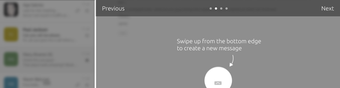
Coach marks
Use coach marks as a single instructional overlay to point out a particular interaction or feature that may not be obvious, or naturally discoverable.
Tutorial
Use tutorials on rare occasions where you feel you need to give the user further instructions to discover gestures or features.
On an environment where the interface may be a little different, a sequence of instructions can be used to point out where different features live. For example, from mobile to tablet the bottom edge can be placed in both panels.
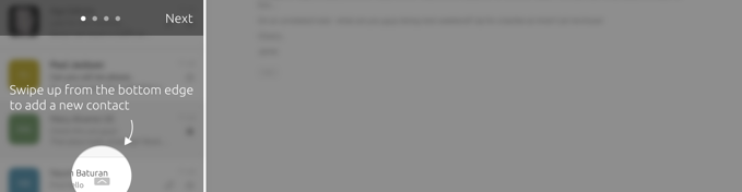
The bottom edge is highlighted in the left panel with instructional text above it, together with a ‘Next Button to lead the user to the following instruction in the tutorial.