 Ubuntu Phone documentation
Tutorials - Ubuntu UI toolkit palette
What the palette looks like now
The Palette has been in need of some updating for some time and we’ve been working hard behind the scenes to update this for OTA 10. We’ve stripped back the palette and rebuilt it from the ground up, considering every aspect as we went along.
Below is an introduction to how the palette is constructed and how we apply it to components in the UI toolkit. The majority of the elements are coming with OTA 10 release, and we will point out those which will come with OTA 11 explicitly.
How the palette is constructed
- Colour set
- Theme
- Palette value
- Palette value sets
The Ubuntu color set
The colors in the color set are the foundation of the palette. However these values or names should never be hardcoded into any component as this will lead to conflicts and misrepresentation of color when other themes will be used. These colors are defined in UbuntuColors singleton.
| Colour name | Colour values | Colour example |
|---|---|---|
| Jet | #111111 |  |
| Inkstone | #3B3B3B |  |
| Slate | #5D5D5D |  |
| Graphite | #666666 |  |
| Ash | #888888 |  |
| Silk | #CDCDCD |  |
| Porcelain | #F7F7F7 |  |
| Blue | #19B6EE |  |
| Green | #3EB34F |  |
| Red | #ED3146 |  |
| Orange | #E95420 |  |
The theme
The theme is the visual look of the UI components. There are two themes which come with the SDK, Ambiance (light) and Suru Dark (dark). The colors a component is painted with depend on the theme chosen by the developer.
Palette values
These are the normal color values given to a specific component. Each palette value name has a semantic meaning and is applied on a certain layer within the application UI.
There are three layers in an Ubuntu UI and those are the following:
- background - the base layer where the application window resides
- foreground - a layer above the base, holding components brought into foreground
- overlay - a layer floating above background, mostly contains popups and dialogs
There are also 2 sub layers which can sit on top of any of these main layers. These are:
- base - sits flat on the surface of any main layer.
- raised - sits proud but not detached from the surface of any main layer.
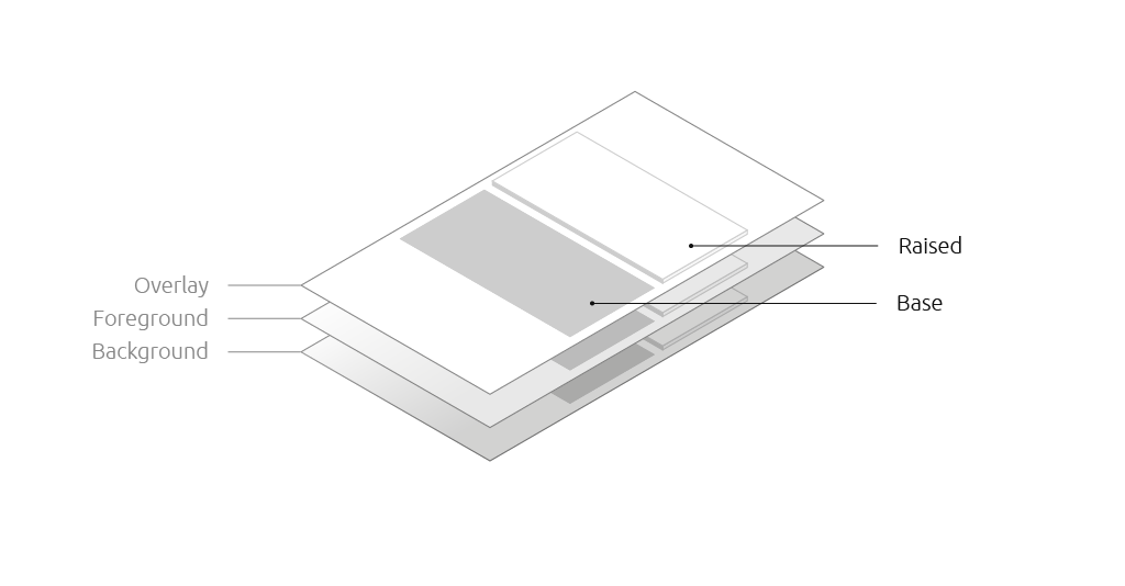
In addition to these there are palette values which are not applied on any particular layer, but mostly color a section of a component. Those will be described in the following chapters in more details.
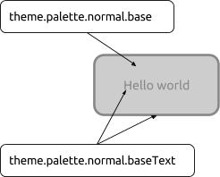
Each palette value follows the UI layer it is applied in, and each of them has at least one palette value suffixed with “Text”, which defines the color value to be used when drawing on the base color or putting a text above it.
Rectangle {
    color: theme.palette.normal.**base**
    border {
        width: 3
        color: theme.palette.normal.**baseText**
    }
    Text {
        text: “Hello world”
        anchors.centerIn: parent
        horizontalAlignment: Text.AlignHCenter
        color: theme.palette.normal.**baseText**
    }
}
Background
These are the colors applied to the bottom level (or background) of the application.
| Background | Ambiance | Suru dark |
|---|---|---|
| .background | White | Jet |
| .backgroundText | Jet | White |
| .backgroundSecondaryText | Slate | Silk |
| .backgroundTertiaryText | Ash | Ash |
| .backgroundPositiveText | Green | Green |
| .backgroundNegativeText | Red | Red |
Base
These are the colors applied to elements that sit flat on the main layers. For example the outline of a text field or the bar of the slider.
| Base | Ambiance | Suru dark |
|---|---|---|
| .base | Silk | Graphite |
| .baseText | Ash | Ash |
Foreground
These are the colors applied to components that sit on top of the background layer. For example the background of a neutral button.
| Foreground | Ambiance | Suru dark |
|---|---|---|
| .foreground | Porcelain | Inkstone |
| .foregroundText | Jet | White |
Raised
These are the colors applied to elements that are raised above the main layers. For example the thumb toggles for sliders and switches.
| Raised | Ambiance | Suru dark |
|---|---|---|
| .raised | White | White |
| .raisedText | Slate | Slate |
| .raisedSecondaryText | Silk | Silk |
Overlay
These are the colors applied to elements that float above the background layer. For example popovers, dialogs and menus.
| Overlay | Ambiance | Suru dark |
|---|---|---|
| .overlay | White | Inkstone |
| .overlayText | Slate | white |
| .overlaySecondaryText | Silk | Slate |
Selection
These are the colors applied to components that have selected content. This should not be confused with the entire component’s selected state. For example text in an editable text field.
| Selection | Ambiance | Suru dark |
|---|---|---|
| .selection | Blue (20% opacity) | Blue (40% opacity) |
| .selectionText | Jet | White |
Field
These are the colors applied to the background of input controls . For example the background of a text field, checkbox or radio button.
| Field | Ambiance | Suru dark |
|---|---|---|
| .field | White | Jet |
| .fieldText | Jet | White |
These are the colors applied to positive actions. For example a positive button.
| Positive | Ambiance | Suru dark |
|---|---|---|
| .positive | Green | Green |
| .positiveText | White | White |
Negative
These are the colors applied to negative actions. For example a negative button.
| Negative | Ambiance | Suru dark |
|---|---|---|
| .negative | Red | Red |
| .negativeText | White | White |
Activity
These are the colors applied to active items. For example the indication of progress on a progress bar or a slider.
| Activity | Ambiance | Suru dark |
|---|---|---|
| .activity | Blue | Blue |
| .activityText | White | White |
Palette value sets
In addition to the palette values above, an item can have a value set to control the look of the item as it enters or leaves a state. The defined value sets are:
theme.palette.disabledtheme.palette.normaltheme.palette.highlightedtheme.palette.focusedtheme.palette.selectedtheme.palette.selectedDisabled
Each value set contains the color value for each of the color names listed above.
Note: the focused value set will land in OTA11.
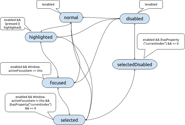
How we define the color of an item
Each item is considered to have different states, though not specified explicitly through a given property or enumeration.
For instance an Item as well as a StyledItem in most of the cases is in normal state, being in normal use. This state is represented by the enabled property. This property can already drive the normal and disabled state. Now, a component can be focused or not, which is driven through the activeFocus and keyNavigationFocus for the StyledItem.
Some items which react on mouse or touch interaction, have a property that drives the highlighted state of the component, for example, AbstractButton has pressed and ListItem has highlighted. ListViews have a special state called selected state, which is used when a given ListView element is set to be the current one through the currentIndex/currentItem properties. A ListView can have a selected element also when disabled, in which case the enabled and currentIndex properties will drive us to the selected disabled state.
These states draw the palette to have a color set for each state so a different color can be applied on the component whenever a given state is entered. These color sets are called value sets. A component can choose the color using the following formula:
theme.palette.valueSet.value
where valueSet corresponds to one of the states enumerated above, with camel case, and value is one of the palette color values listed in Palette values.
When coloring a component it is highly recommended to choose the value set corresponding to a given state of the component, and never choose a different color value from the value sets.
The wrong way:
Rectangle {
    color: enabled ? theme.palette.normal.base : theme.palette.disabled.overlay
}
The right way:
Rectangle {
    color: enabled ? theme.palette.normal.base : theme.palette.disabled.base
}
For example, coloring a custom Button could be done in the following way:
Rectangle {
    signal clicked
    MouseArea {
        id: mouseArea
        anchors.fill: parent
        onClicked: parent.clicked()
    }
    color: enabled ? (mouseArea.pressed
                     ? theme.palette.highlighted.base
                     : theme.palette.normal.base)
                   : theme.palette.disabled.base
}
Coloring the selected element of a ListView on the other hand is a lot different:
ListView {
    id: listView
    model: 10
    delegate: ListItem {
        // [...]
    }
    highlight: currentItem ? highlightComponent : null
    Component {
        id: highlightComponent
        Rectangle {
            color: listView.enabled ? (listView.activeFocus
                                      ? theme.palette.focused.background
                                      : theme.palette.selected.background)
                                    : theme.palette.selectedDisabled.background
        }
    }
}
The following diagram illustrates the state transitions of a component driving the colors.
Choosing the palette value set automatically
We are working on an API to chose the color value set based on the component’s current state. This will be an extension of the StyledItem and ThemeSettings component, and we hope it will reach the toolkit in OTA11. With the API available, component styles will no longer need to use huge bindings to find out the color set to be used, but instead will be able to use a simple binding line. The API is in prototyping phase, thus this chapter will be updated later.